A landing page is where the magic happens — where prospects convert into customers and leads convert into sales.
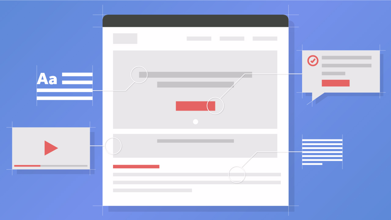
The problem is that, as a small business owner, you might still be trying to get your head around a landing page. What is it exactly and what forms the backbone of a successful one?
A landing page is pretty self-explanatory: It’s the entry point for your site. In other words, it’s the first page your site visitors “land” on when they visit you. To keep your bounce rate low and your conversions high, then, it has to be properly optimized.
This can be tricky. Optimizing landing pages is still one of the biggest challengesfaced by B2B marketers. In fact, it’s in the top five. Moreover, around 3⁄4 businesses struggle to optimize their landing page for copy among other things.
The struggle is real. But first impressions are everything, and if your entry point for prospects is weak, they’ll soon bolt out of the exit.
Not on our watch! We prepared a handy step-by-step guide to crafting a perfect landing page, from its structure and SEO to visuals and popups.
Let’s start with…
Step 1: Define the structure
Structure comes first brings it all together so that your page is well-presented and easy to read.
The basic structure of a landing page is simple:
- A headline
- Copy
- The call to action (CTA) or a subscription form
Images and videos can be included along the way but the structure has to be kept simple. Why? Too many distractions will cause a paradox of choice, as we mentioned earlier.
Moreover, a bad landing page is one that contains navigational links that take people away from the page before a conversion has been sealed. That’s not what you want.
Keep the structure super simple. It’s really just 3 things, and each one — the headline, copy and CTA — is focused on one thing, which is getting your visitors to take a specific action.
Step 2: Create a strong headline
The first thing anyone sees when they visit your landing page is your headline. Attention spans on the internet are short, and according to research, you have only 8 seconds to grab someone’s attention with your headline. If you fail, they’re gone.
If you get it right, however, over 90% of site visitors who read your headline will go onto reading your copy and your CTA.
For this reason, it has to be amazing.
Here are some tips for a successful headline:
1) Monitor your analytics to find out how people are landing on your page — ergo, where are they coming from? If it’s a specific ad that is driving the majority of your ads, your landing page headline needs to match its message. Otherwise, you’ll miss out on conversions. For example, let’s say that the ad mentions a free trial but your landing page headline doesn’t. It’s going to create confusion and your bounce rate will soar.
2) Know your audience — if you don’t know who you’re talking to, your headline will fail to communicate and resonate with the right people. To talk in a language your site visitors will understand, you need to understand their persona. Again, analytics will help you uncover more about who your audience is, including their intent. Then, you can use this information to craft a stronger headline that resonates and which has that all important emotional connection.
Choice Screening knows their audience. They’ve done their research. Check out their headline below:
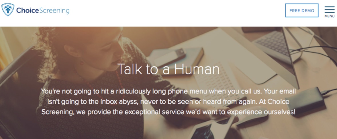
Choice Screening clearly know what pains their audience the most — spending ages talking to a robot who doesn’t understand their concerns!
3) Know what people want — What is your target audience actually looking for? What is their biggest problem and how are you going to solve it? A good headline identifies a prospects problem, and then shows them how it’s going to be resolved. For example: “How to Get High Ticket Clients If No One Has Heard of you.” The problem is that no one has heard of us … and the solution is right here on this website.
4) Employ the right words that push emotional buttons and/or arouse curiosity — These include:
- Secret
- Now
- New
- Exclusive
- How To
- Why
5) Add numbers — ‘How I Helped Clients Get More Leads’ sounds okay, but it’s ultimately very vague. There’s a lack of facts — and people love facts. So try this: ‘How I Helped 260 Clients Get 48 Qualified Leads In One Day.’ Facts are facts, you can’t argue with them. They lend your headline more credibility in an instant.
6) Keep it focused — Don’t be vague. Focus on one thing. Be simple. Fomo kept things simple with their headline. They remind us of something we might be missing out on, and then show us how we no longer have to miss out on it:

Ryan Kulp, the founder of Fomo, emphasizes the importance of a straightforward headline:
Use your headline to say something bold. Then back it up by linking your solution to that statement somewhere nearby.
7) Create a powerful hook — Glen Allsopp, the founder of Detailed, shares his protip on crafting a strong headline:
The headline of a landing page is everything. As someone who just redesigned their own homepage with this in mind, your primary focus should be the hook.
Not just what words to put in your headline, but what people will remember even if they don’t opt-in (people do come back later, after all, or tell their friends when looking for a similar resource).
On my landing page I mention how Google blocked some of our SEO tactics because they are so effective. Even if you’ve been in SEO forever and seen every pitch out there, that should get your attention.
I’ve had many people comment on it.
I’ve seen people use examples such as “We’ve never had a client ask for a refund” or “People at [big company] subscribe” and they certainly get my attention.
Spend more time on your hook than anything else and you’ll be rewarded for it.
Step 3: Write compelling copy
With a landing page, you can’t go straight from the headline to the CTA and make your offer. Why not? Because you need to warm your visitors up and build up some motivation before you go and ask for something.
First comes the headline and then comes the copy. The copy needs to reinforce what the headline has promised; it needs to elaborate on it, create more understanding of what you’re offering, before your CTA asks your visitors to take action.
The copy must be short, relevant, direct, engaging and it must build interest in what you’re selling. The focus must be at all times on getting people to take an action. Ryan Kulp adds:
Meet your prospect where they’re at, then pivot to your solution. I heard this once from a copywriting coach, and it stuck with me.
Here are some tips:
1) Outline the benefits — What will ultimately dictate the kind of copy you write for your landing page is your buyers persona and the stage they are at in the buying journey.
For example, your analytics might tell you that the core of your site visitors know all about the solution you’re offering and are almost ready to take the next step. In such an instance, your copy needs to be very good at reinforcing the benefits of your solution so that you nudge people in the right direction.
Harvard recently carried out a survey and found that we’re “at the end of solution sales.” In other words, your copy needs to shift focus from reiterating what you’ve got to what it can do for people.
For example, let’s say you run a copywriting service. In your body copy, the benefits might be thus:
- English speaking writers
- Highly professional, delivery always on time
- 100% money back guarantee
2) Roll out the most important info first — To have as much impact as possible, you need to be hitting a home run immediately and wowing the crowd. Readers won’t stick around waiting for you to get to the juicy bits. Skip the beginning and go straight into the middle, before finishing with a flourish.
3) Be conversational — This means writing the way you speak. It means breaking the rules of grammar if necessary. It means being personable, funny (where permissible) and writing in the first person. Have two-three sentences at most in one paragraph. Include words like “yours” and be direct with your writing.
4) Always proofread — In fact, you should download and use a tool like Grammarly to make sure you haven’t made any glaring errors that make you look unprofessional.
5) Exploit white space — It’s more readable.
6) Employ bullet points — Bullet points should be reserved for key points, such as the benefits. They improve impact. Bullet points should list essential things a prospect stands to gain if they do business with you. Take a look at how Figma have done this below.
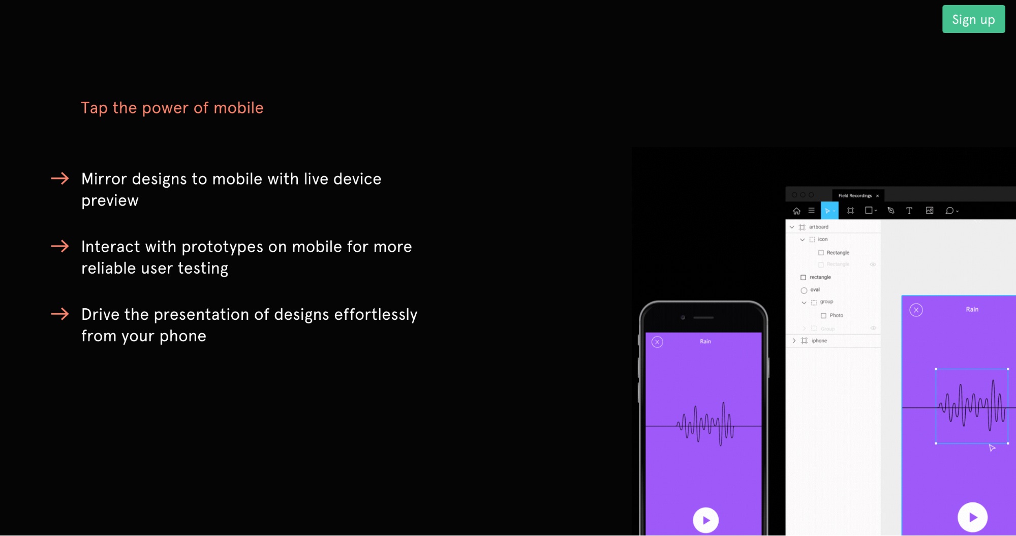
Figma have used bullet points to zoom in on their benefits, and words like “effortlessly” are designed to have the maximum impact with their prospects.
If you’re really in doubt about your copywriting skills, you should consider hiring a professional copywriter. There are global freelancing platforms, such as upwork.comand freelancer.com that are home to pro copywriters, but you can also find expert writers via Google and on social media platforms, such as LinkedIn.
Step 4: Add a powerful CTA
The headline is what keeps someone on the page immediately but the CTA is the money shot. It’s where a prospect becomes a customer. All your copy and your headline has warmed your customers up, and now it’s time to go in for the kill with a killer CTA that’s correctly placed and contains an offer too good to miss.
Here are some tips:
1) Make just one offer — If you make more than one offer, your prospect will fall victim to the paradox of choice. Faced with multiple offers, they’ll back away and take no action at all.
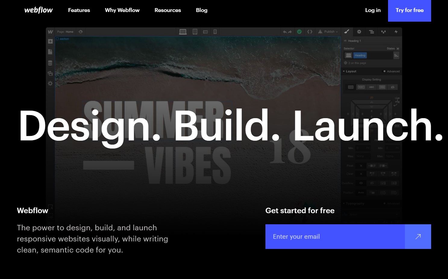
2) Be visual — A CTA needs to stand out and catch people’s attention. What good is it if no one even notices it?
Check out Webflow’s eye-catching CTA buttons below:
3) Make a button — CopyBlogger carried out some research into this and found that a button CTA boosted conversions by 45%.
Of course, you can’t just make any old button. Check out what Square did below. They contrasted a button with a high-quality photo to ensure it stood out.
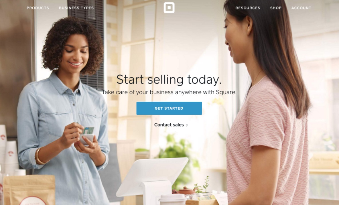
4) Write in the first person — When you write in the first person — “start my free trial today!” — you’re creating a sense of ownership and directly involving the prospect.
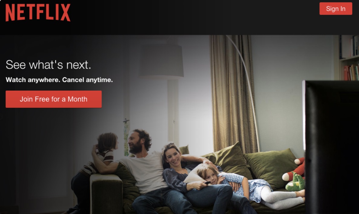
5) Make this look easy — Check out what Netflix did below. A lot of buyers are wary that they might sign up for something they can’t get out of. “Cancel anytime” goes a long way to minimizing anxieties.
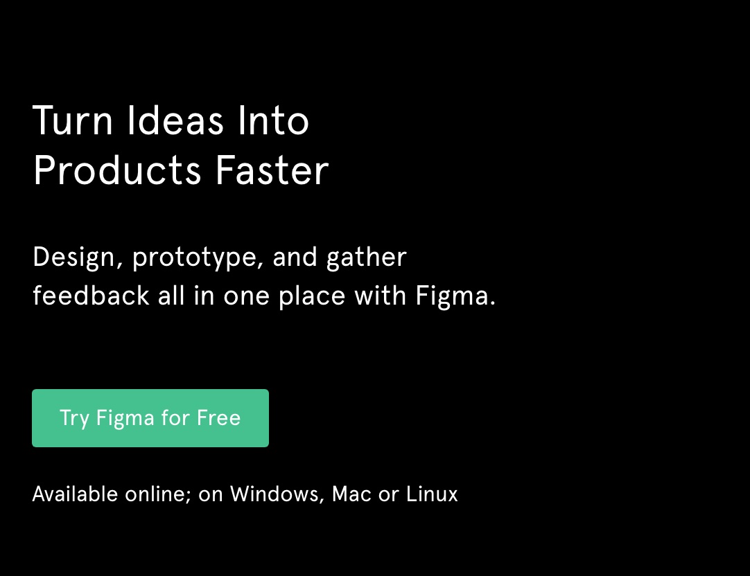
Like Netflix, Figma makes it look easy with their “Try Figma for Free” CTA. It’s also worth mentioning that Figma has a CTA at the top of their page and at the bottom.
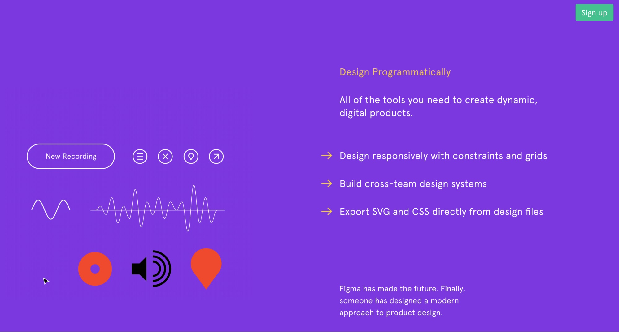
They don’t stop there, though. Figma’s “sign up” button is ever present at the top right of your screen as you scroll up and down the landing page. This is pure optimization:
Step 5: Optimize your landing page
The problem with everything we’ve mentioned so far — killer copy, eye-catching headlines and crushing CTAs — is that all of them will struggle to convert if your SEO game is weak.
Even if your copy is Hollywood-worthy, it means nothing if you’re not driving traffic in the first place.
This is where SEO comes in. Good SEO not only drives traffic to your landing page — it drives the right traffic.
The issue you might have is that a promotion you’re running is only lasting a few days. Therefore, does SEO really matter? Possibly not. But if your promotion is lasting a few weeks or months, you need to optimize your page for SEO.
Here are some tips:
1) Create a custom URL — In other words, always publish a landing page to your domain — as opposed to a third party, such as Wordpress. For subpages and features, use SEO- and user-friendly URLs — such as yourdomain.com/contact or yourdomain.com/your-feature.
2) Find the right keywords — Keyword research can be tricky, which is where an SEO tool like Nightwatch comes in handy. Find the ones that are relevant to your page and which your customers are using, and then add them to your copy, meta tag, page title and description. Add them to any image files you use, too.
3) Get backlinks — Backlinks will increase your page’s credibility in the eyes of Google. Once you secure a link from an authoritative site to your own, your ranking should improve. Make sure you’re monitoring your backlinks properly, too.
4) Check your site speed — Lastly, because Google uses site speed as a ranking factor, you need to make sure that yours is up to speed. Make sure you optimize files, minify javascript files and html, and adjust images for retina and non-retina screens.
Step 6: Make sure your landing page is ready for mobile
Mobile usage overtook desktop for the first time ever in 2016. Meanwhile, in the eCommerce world, 70% of all traffic is expected to come via mobile devices in 2018.
Despite these facts, there are so many landing pages that are not mobile ready.
Imagine you’ve got time to kill in a foreign airport due to a flight delay. With 2 hours until you take off, you decide to pop online via your mobile device and do some browsing. But when you arrive on a website, you’re left with even more frustration — it’s taking ages to load! Just one of them days, huh?
In 2018, we expect a website to be mobile ready. When it isn’t, frustrations run high, and if it hasn’t loaded after 3 seconds, we’re probably going to bail out.
To this end, you need to focus on two things: mobile responsiveness (how a website can adjust and be readable on smaller devices) and speed.
You need to run your site through a site speed tester — you can use Google’s free one— to make sure it’s fast on both desktop and mobile, and you need to optimize your page for different screen sizes, too.
Whichever website builder you use will be able to help you with this. For example, Wordpress has its own built-in solution to help you prime your pages for mobile devices.
Step 7: Carefully choose the visuals
Visuals are important on your landing page. But there’s a right and a wrong way to use visuals — and over half of us are doing it wrong.
For example, check this stat out: 58% of off-related graphics on a landing page are clickable. Does that sound like a good idea? It isn’t, and the reason is that once someone has clicked on an image that takes them away from your landing page, you’ve just lost a chance to convert them. They’re now elsewhere and out of the game.
1. Images
The problem with visuals is they’re kinda hard to do if you’re not a naturally visual person. What image do you choose? Where should it go exactly?
Firstly, an image is a super important element of your landing page. We process images 60,000 times faster than we process text, and images are very good at making us feel a certain way. Want to emphasis how good a customer will feel if they use your product or service? A carefully chosen image can help with this.
The first obstacle you need to overcome is the image itself. Typically, a landing page will include one of the following:
1) Your solution — This makes your product tangible. If you’ve got a tech product, why not show how it would look on various devices?
2) An individual using that solution — If someone is using your product and looks happy and at ease with it, this can have a positive impact on your prospects
3) A how-to video — People will be more encouraged to buy something if they know how to use it
4) An illustration — This can also be a how-to guide, but an illustration just stands out more. Or, it can be something cute that’s funny and engaging — like what Fomo did.
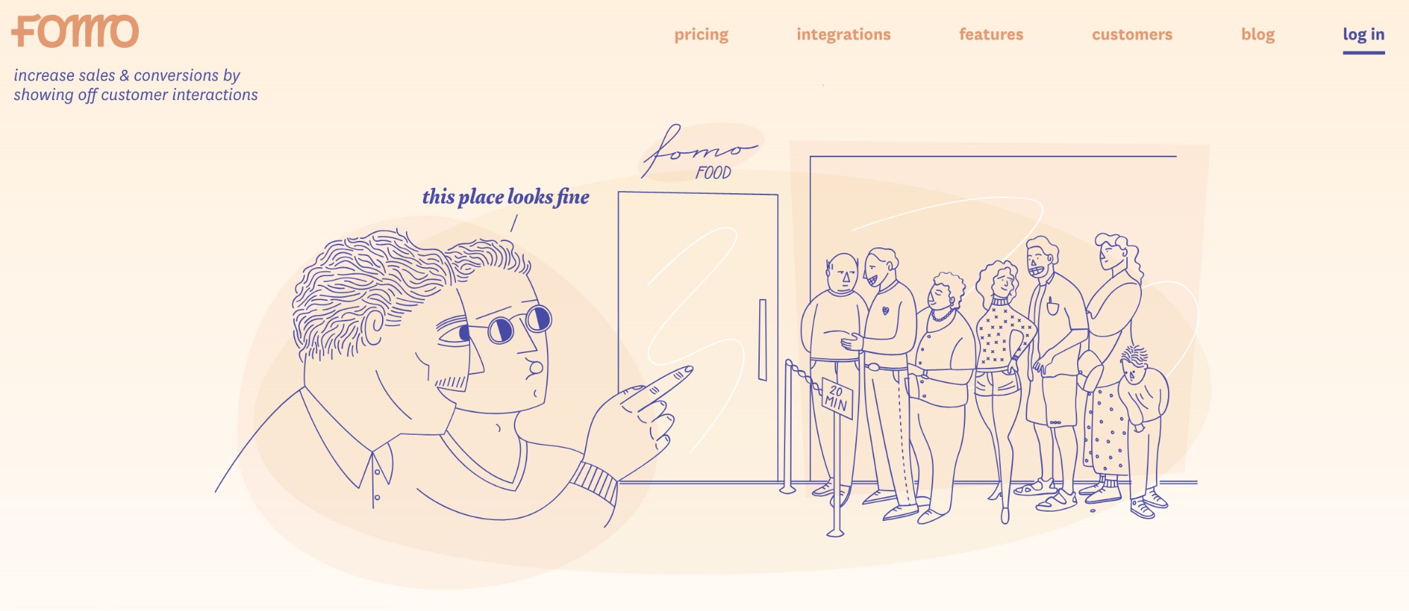
Ryan Kulp, the founder of Fomo, shares the idea behind it:
If you illustrate, make it something that only applies to you.
We identified the “online equivalent of a busy restaurant” as an approachable way to describe what our product does, so we drew a line outside of a busy restaurant. No other business could use this graphic, it wouldn’t make sense.
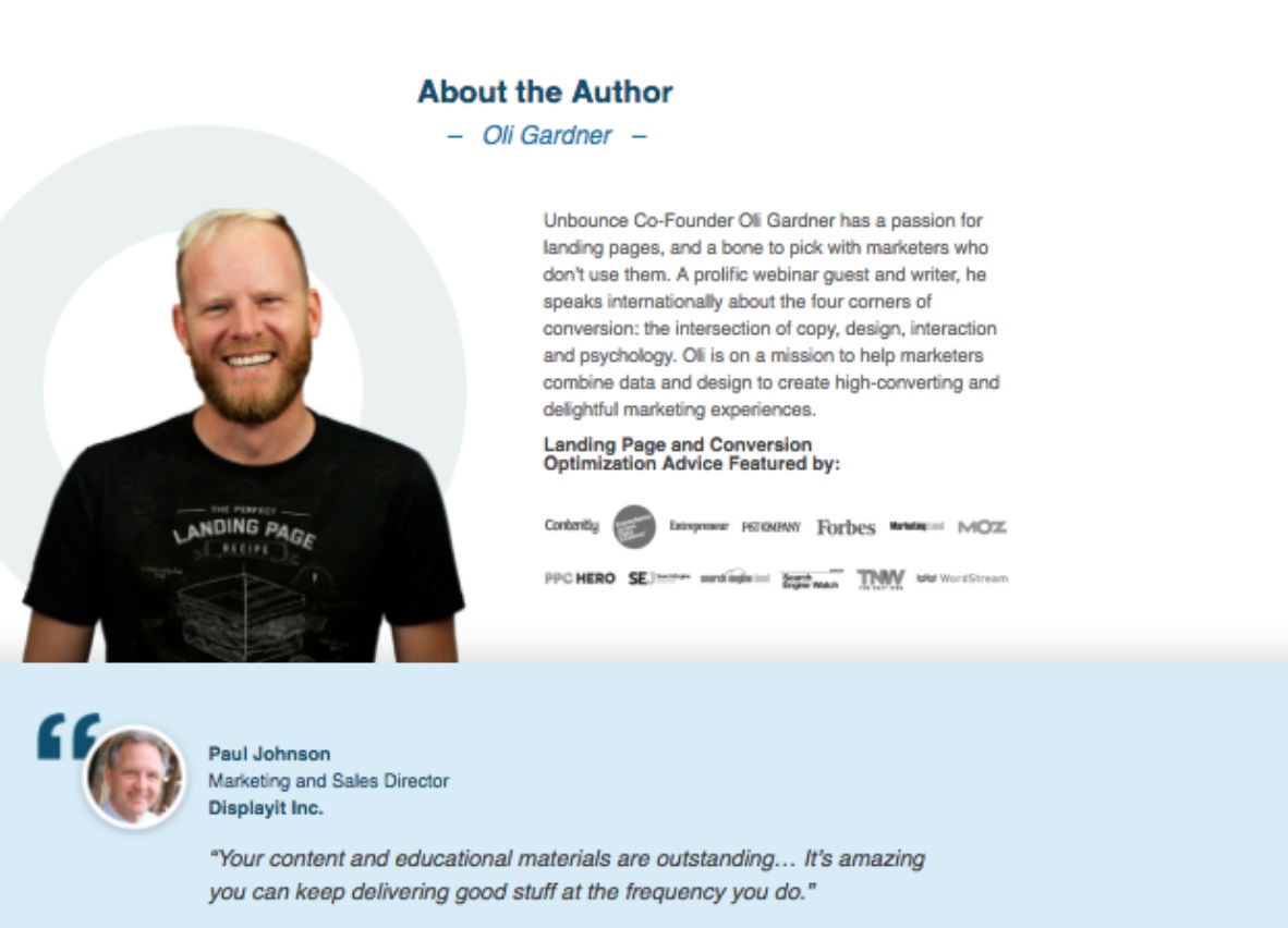
5) An image of the founder or product’s users — Unbounce went for the latter and accompanied an image of their founder (look how friendly he looks!) with an “about” section. No one can say this doesn’t work — Unbounce actually wrote a whole book on landing pages that convert:
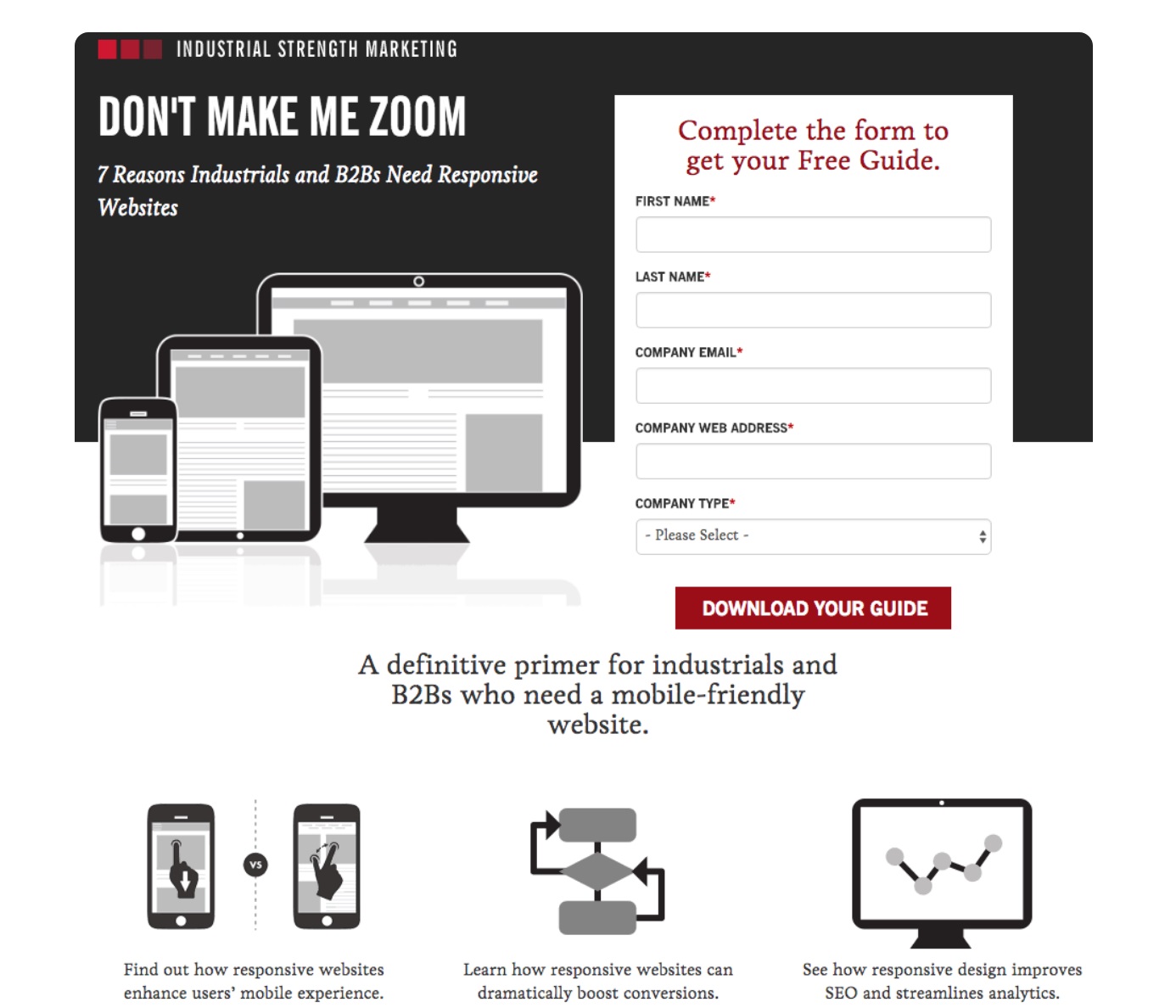
Industrial Strength Marketing, meanwhile, went for illustrations:
Here are some more tips:
- Images should only come with a link if it opens a form. If not, leave the links out.
- Other than that, images must not be too big, otherwise they’ll slow your site speed down. Keep in mind that the most common monitor resolution is 1366 x 768 pixels, and it’s reasonable to limit the resolution of images to 1600 x 1200 pixels maximum.
- And when you do use images, don’t use too many. The last thing you want is for images to act as a distraction.
Videos
As well as images, get involved with videos if possible. It was forecast that 74% of all internet traffic will come from videos in 2017. The reason? People love to watch them! Just using the word “video” in a subject line is enough to send email open rates soaring by 19%, which means that — while an email isn’t a landing page — people want to see them.
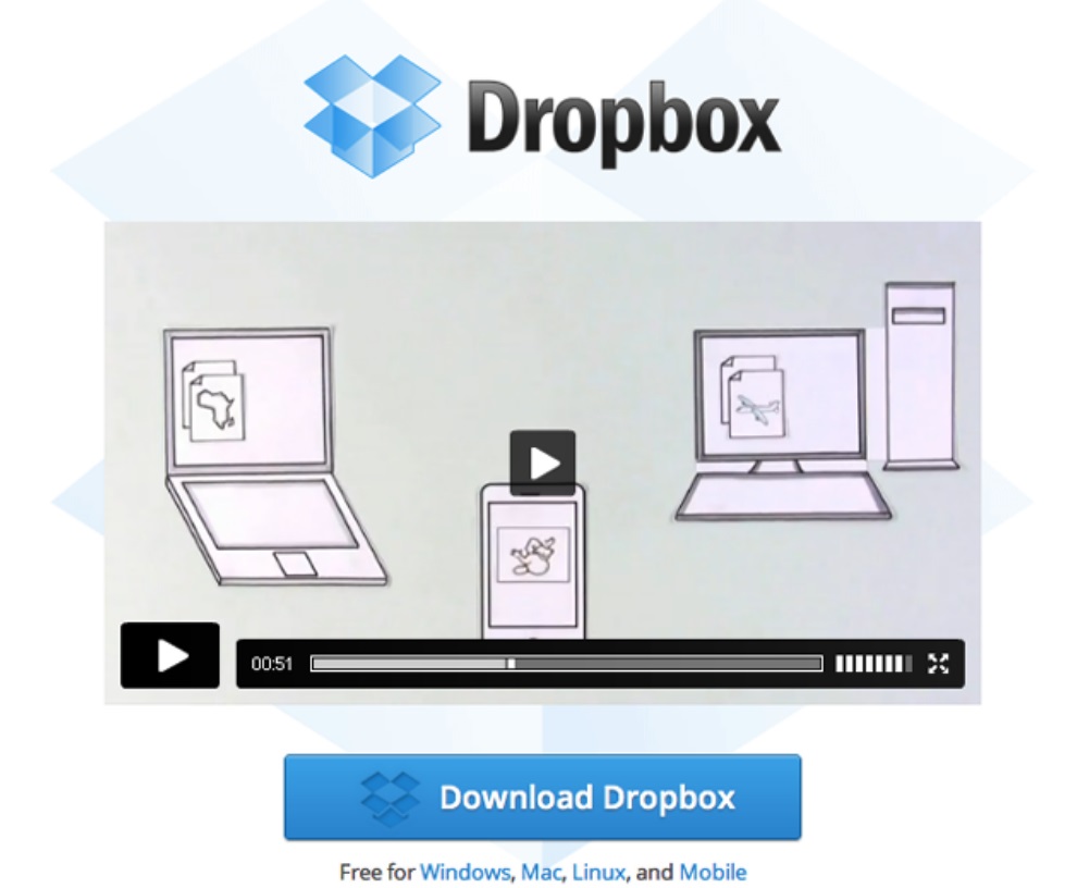
One of the best types of videos you can use is an animated explainer video. An animated explainer video is a great way to explain what your company is all about in a fun, engaging and informative way to prospects who were otherwise unsure about what it is you do. This improves trust and convinces people about your product.
In fact, there was a time when Dropbox’s landing page consisted of just an animated explainer video. What it did for their conversions was incredible — it bagged them $48,000,000.
Fonts
As well as images and video, a good landing page also needs good font that’s consistent with the company’s brand, and which the targeted audience will respond to.
Here at Nightwatch, we’ve used custom fonts for our landing page that align with the rest of our overall style.
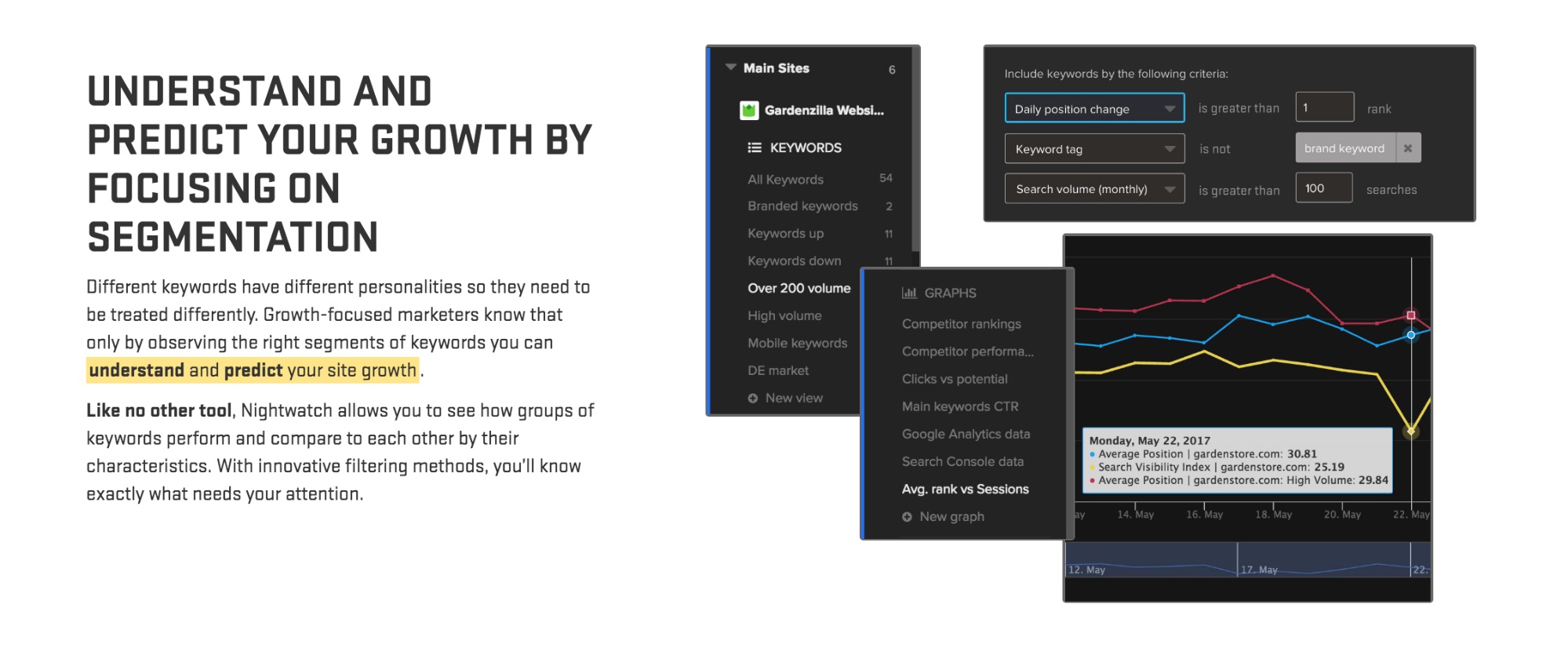
Whichever web development/hosting platform you use will offer a range of fonts that you can experiment with, but to add a custom font you’ll need to follow your website platform’s guidelines. You can use custom font services like Google Fonts and Typekit, too.
How you use your fonts is key. Take another look at our landing page in the image just above. We’ve used bigger font for the information we want to draw eyes too immediately, and we’ve bolded the text that makes an important point, or which offers a specific benefit — for example, “like no other tool.”
Consider color, too. The image below is the top of our landing page — it’s the first thing people see. As such, we’ve arranged the color of our font so that it’s as visually striking, exciting and as engaging as possible. It’s our hook.
Then, we switch from turquoise font set against a black background to a more traditional black font set against a white background as we relay information to our audience.
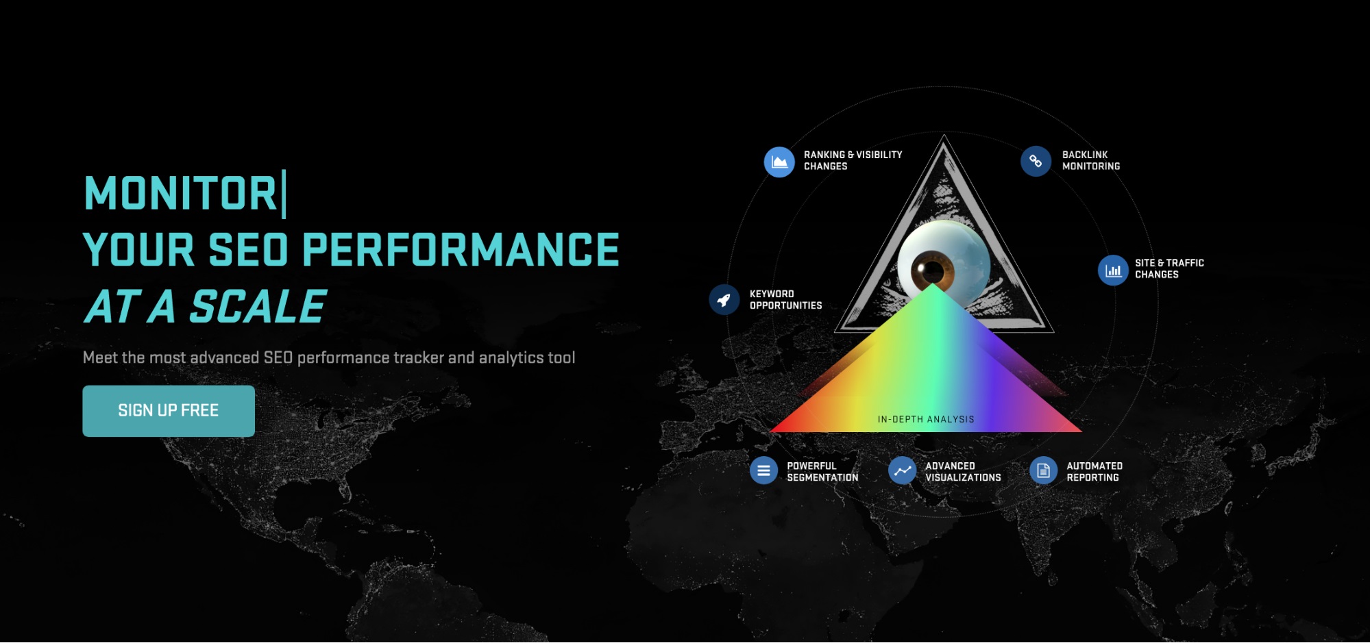
Of course, there are different ways to use fonts, colors and backgrounds, and it all depends on your target audience and your message. Figma — as seen in the image below — literally never let up with their use of bold, electric colors throughout their landing page, from top to bottom.
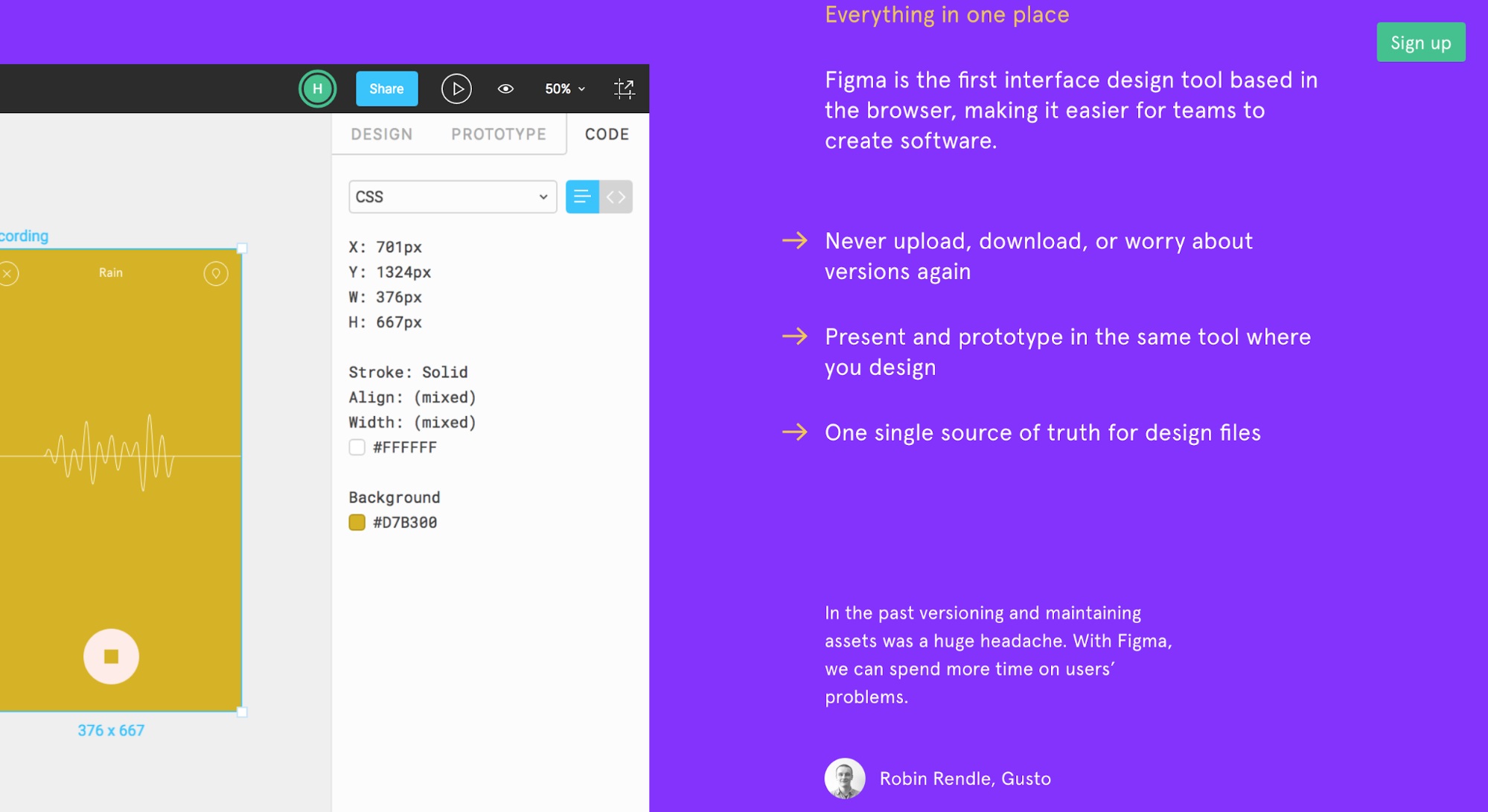
Consider the way they’ve used their fonts on this section of their landing page, too. The headline is amber, the core points are white, and the quote at the bottom is white — but smaller. This is all to do with something called message hierarchy. They use different fonts/sizes to create contrast and differentiate between the importance of a message, as well as the type of content.
For example, the quote at the bottom is smaller and this makes it clear that it’s a different piece of content from that above.
Step 8: Craft a trustworthy contact form
One of the most important parts of a landing page is the contact form. For whatever reason, however, it isn’t always something many of us give weight to.
The thing is, a good contact form requires good copy. Why? Because you need to demonstrate — in very few words — why someone should be getting in touch with you. If your copywriting skills aren’t up to scratch, you’ll struggle to convert anyone.
As well as good copy, a contact form also needs:
- A strong CTA
- An email address (and even a phone number if you want)
- A few fields that help you learn more about the person who is contacting you
- Links to your social media profiles
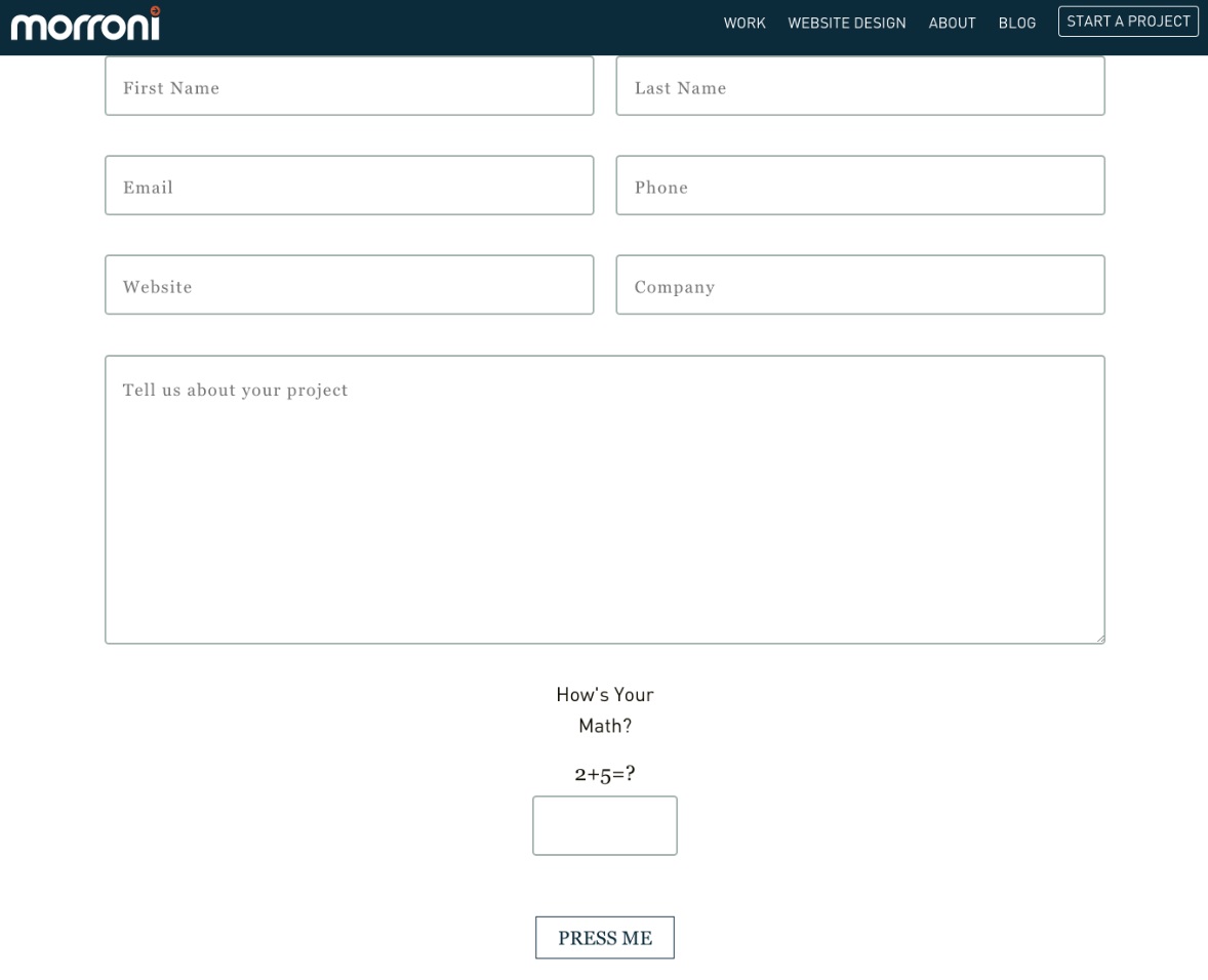
- Overall, a good contact form must be clean, clear, simply designed, and there mustn’t be too many fields — but at the same time, you need to make sure you get all the information you need.
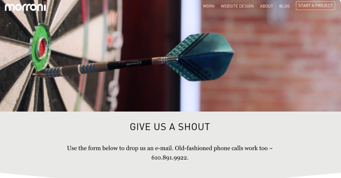
Morroni is a good example of a contact form that brings everything together:
And just in case you were wondering, yeah, they’re pretty good at copy, too:
Step 9: Add some social proof
Why would someone who’s never heard of your business before take a chance on you if there’s no evidence that anyone before them has bought from you — and enjoyed the experience?
Chances are, they won’t.
This is where social proof comes in. Social proof on your landing page — be it in the form of testimonials or reviews — gives your page and your company credibility. It helps to build trust among new prospects and further pushes them towards a conversion.
Indeed, research has shown that 90% of customers admit that online reviews have a major impact on their buying decisions.
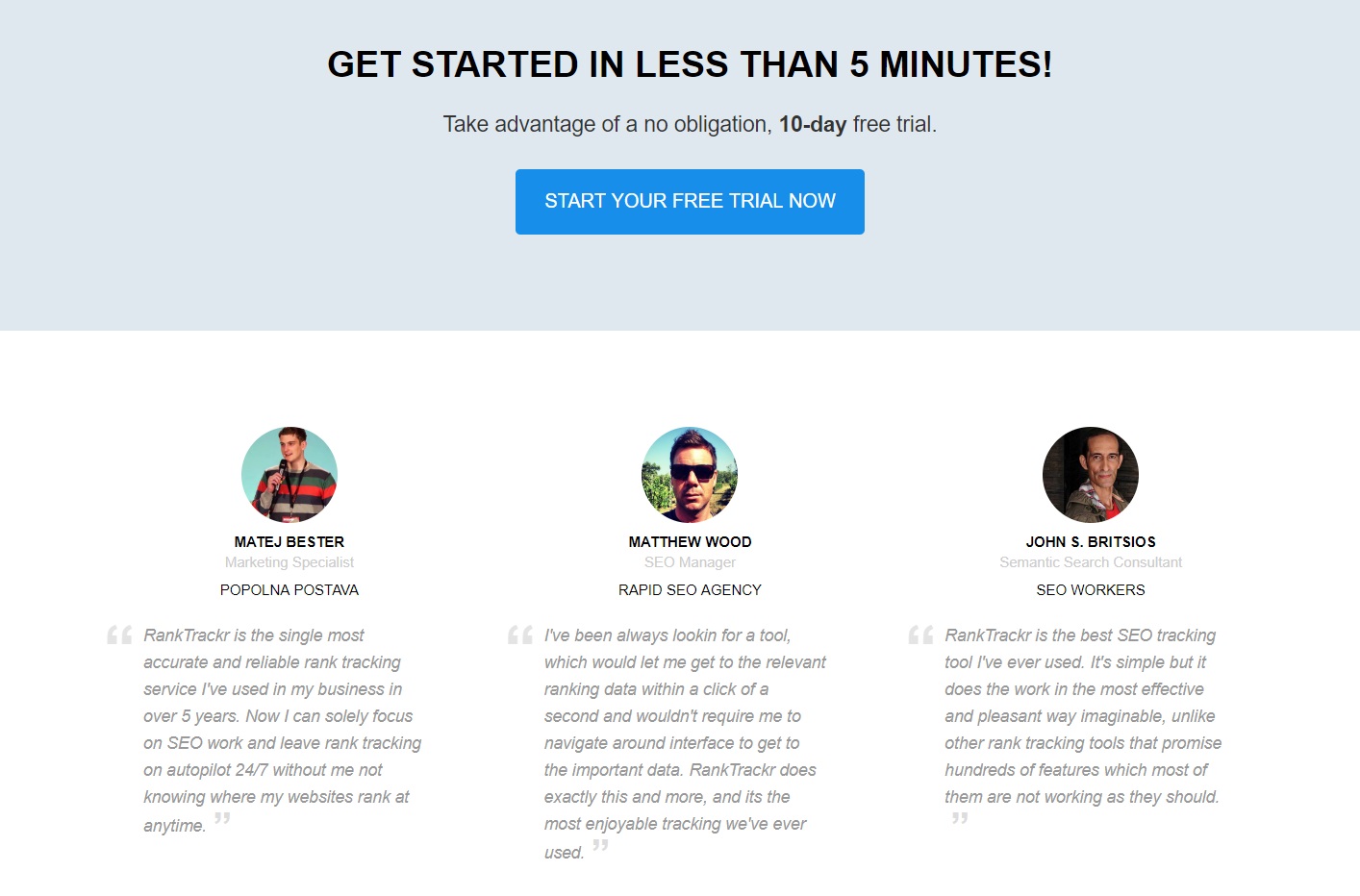
And the best thing to do is to plaster online reviews and testimonials on your landing page, right where people can see them. This will boost initial impact. Like we did one the landing page of our other rank tracking tool RankTrackr:
Step 10: Use pop-ups wisely
Pop-ups are all about keeping your site visitors in the game before they bail out and you’ve lost them before they’ve converted on your landing page. They’re a tricky one to get right, but more and more businesses are using them because the stats show that — if done right — pop-ups convert by as much as 9.28%.
On the other hand, if you use pop-ups incorrectly, you will annoy your visitors and your conversions will take a hit.
Here are some tips:
1) Get the timing right — If your pop-up appears too soon, it could harm your conversions. The same is true if it appears too late. Fortunately, timing isn’t a guessing game because Unbounce did a bit of experimentation and found that 60 seconds is the magic time to display your pop-up. Why? Well, the general idea is that if someone has stuck around for a whole minute they’re clearly interested in what you’ve got to offer.
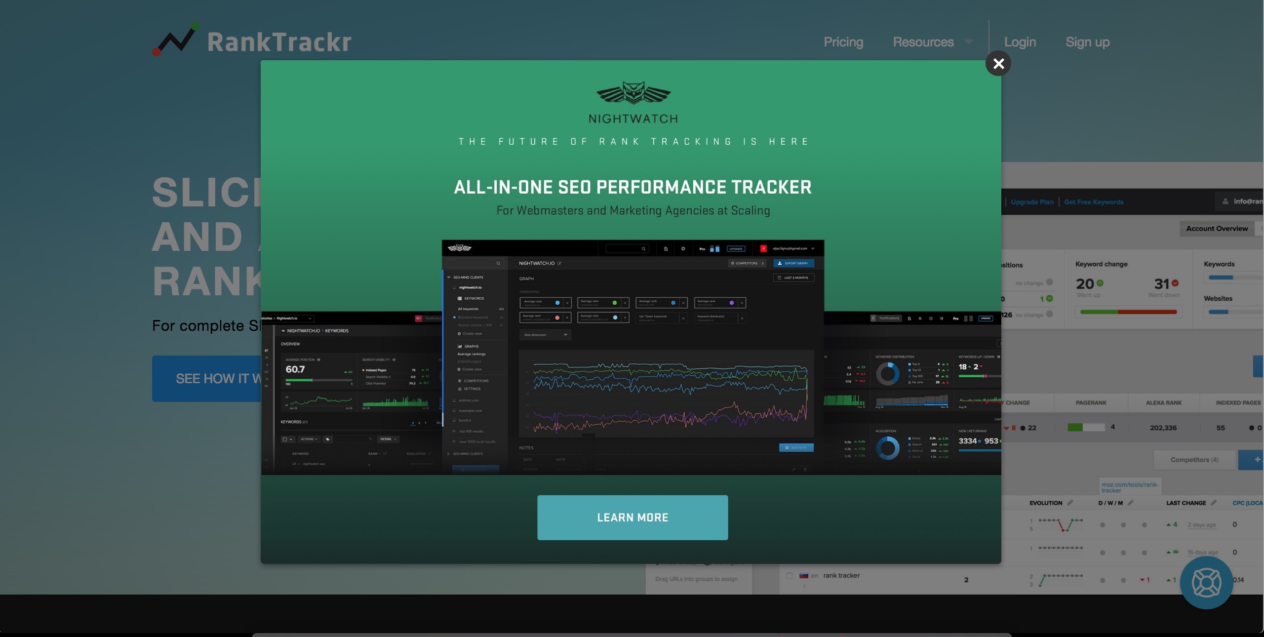
For RankTrackr, we designed our popup to fill in the gaps and push visitors forward the next step — trying out a more advanced SEO performance tracking tool Nightwatch:
2) Make the right offer on the right page — With pop-ups, you can’t adopt a “one-size fits all” mentality. Imagine if I drop a few items into a cart and then abandon it at the last minute. Just as I go to leave the page, a pop-up appears asking if I want a free eBook. Erm, no! On the other hand, if the site had used onsite retargeting to present me with a more relevant pop-up that offered me free shipping, I might have been tempted to finish my order. For a landing page? Generally, you’ll want to offer a free gift (lead magnet) in exchange for an email address.
Step 11: A/B test it
And lastly, make sure you test everything and stay open to experiments. SEO consultant and digital marketer Abra Miller shares her expert tip:
Once you’ve made your landing page the best you can, now it’s time to get your audience to do the hard work.
Find out what they think. Test it! Experiment with your visuals, copy, CTAs, testimonials, layout. Just make sure you set a hypothesis and test one element at a time — otherwise you won’t know what’s made the difference.
There’s tons of simple A/B testing software out there — you might be surprised by what you find.
Final thoughts
Your landing page is the key to your success online — and all its elements should work together and focus on one goal: converting prospects into customers.
Let’s revise all our ten steps to an effective landing page:
- Define the structure
- Create a strong headline
- Write compelling copy
- Add a powerful CTA
- Optimize your landing page
- Make sure your landing page is ready for mobile
- Carefully choose the visuals (images, videos, fonts)
- Craft a trustworthy contact form
- Add some social proof
- Use pop-ups wisely
- A/B test it
If you can bring all the above elements together and get this right, it shouldn’t take too long till you start seeing an increase in conversions and sales.
Have any tips of your own? Make sure to let us know in the comments!
